There are roughly 2–3 seconds between a passing driver noticing your wrapped vehicle on the 401 and that vehicle disappearing from view. In that window — at 100km/h — your font choice is either working hard for your business or silently failing it. Choosing the right vehicle wrap fonts is one of the most consequential decisions in your entire wrap design, yet it’s one of the most commonly overlooked by business owners across Toronto and the broader GTA.
This guide breaks down exactly what makes a typeface legible at highway speeds, which font styles to use (and avoid), and how to work with a professional design team to maximize every square centimetre of your wrap’s visual real estate.
Why Vehicle Wrap Fonts Are a Science, Not Just a Style Choice
Typography on a moving vehicle is a completely different discipline from typography on a website, a business card, or a storefront sign. Static viewers have unlimited time to process. Drivers and pedestrians do not.
Legibility researchers commonly reference a principle called the 7-second rule for outdoor advertising: a viewer must be able to read and understand your core message within 7 seconds. At highway speeds in Ontario, that window shrinks dramatically — especially when you factor in traffic, glare from the sun, and varying viewing angles on roads like the Gardiner Expressway, Highway 400, or the QEW through Mississauga.
The stakes are real: a vehicle with illegible lettering is essentially a moving billboard with the lights off. You’ve paid for full-colour vinyl, professional installation, and premium materials — and passers-by still can’t read your phone number.
The good news? With the right approach to commercial vehicle lettering, your wrap becomes a high-performance advertising tool that generates thousands of daily impressions across the GTA.

The Core Principles of High-Speed Readability
Before we get into specific font recommendations, it helps to understand the underlying principles that determine whether a typeface performs at speed.
1. Stroke Weight: Go Bold, But Not Extreme
Thin letterforms — those elegant hairline fonts popular in luxury branding — collapse visually at distance. Individual strokes become too fine to register quickly. On the other hand, ultra-heavy or “ultra-black” weights can cause letterforms to fill in and lose their distinguishing features.
The sweet spot for vehicle wrap fonts is a medium-bold to bold stroke weight, roughly what typographers classify as 600–800 weight in variable font systems. Think confident, not cramped.
2. Letter Spacing (Tracking): Open It Up
Text on a vehicle wrap needs more breathing room than text in print. Tight tracking causes letters to merge visually when viewed at an angle or from a distance. As a general rule, increase letter spacing on your wrap design by 5–15% beyond the font’s default — more for smaller text blocks, slightly less for large headline text.
3. X-Height: The Bigger, the Better
The x-height is the height of lowercase letters (like “x”, “a”, “n”) relative to the capital letters. Fonts with a tall x-height are dramatically more legible at speed because the lowercase portion of words carries most of the word recognition load. Studies show that when x-height is low, you lose legibility fast.
Compare these two approaches: a condensed serif with a small x-height will struggle on the side of a van doing 80km/h through Brampton. A geometric sans-serif with a generous x-height reads clearly from 30 metres away.
4. Contrast Against Background Colour
Even the world’s most legible typeface fails if it’s set in a colour that doesn’t contrast adequately with the wrap’s background. The WCAG (Web Content Accessibility Guidelines) contrast ratios translate well to vehicle wrap design — aim for at least a 4.5:1 contrast ratio between your text and background colour. In practical terms:
- White or light yellow text on a dark background (navy, black, forest green) = excellent
- Black or dark navy text on white, silver, or light grey = excellent
- Red text on dark backgrounds = poor legibility (both colours have low luminance difference)
- Orange text on yellow = avoid entirely
Font Categories: What Works and What Doesn’t
| Font Category | Legibility at Speed | Best Use Case | Examples |
|---|---|---|---|
| Geometric Sans-Serif | Excellent | Primary headline, phone number, web address | Futura, Montserrat, Proxima Nova |
| Humanist Sans-Serif | Excellent | All text, especially taglines | Gill Sans, Myriad Pro, Calibri |
| Condensed Sans-Serif | Good (bold only) | Secondary info where space is tight | Impact, Bebas Neue, Highway Gothic |
| Slab Serif | Good | Bold brand names, truck/trailer side panels | Rockwell, Clarendon, Archer |
| Script / Handwritten | Poor | Avoid for key info — decorative accents only | Any script font |
| Display / Decorative | Poor | Avoid for phone numbers, addresses | Grunge, brush, retro styles |
| Thin/Light Weight | Very Poor | Avoid entirely for vehicles | Any weight below 400 |
The Best Vehicle Wrap Fonts in Practice
Montserrat Bold is arguably the most versatile typeface for commercial vehicle lettering in Ontario. Its geometric structure, generous x-height, and wide character spacing make it consistently legible across different viewing distances and lighting conditions — from a rainy Highway 27 at dusk to a sunny day on Eglinton Avenue in Toronto.
Futura Bold has been a workhorse of signage design for decades. Its perfectly circular letterforms stand out from organic shapes in the visual environment, making it particularly effective on vans and trucks moving through urban traffic.
Bebas Neue is a popular condensed all-caps display font that works well for large headline text (think the company name across the top of a trailer wrap) but should not be used for phone numbers or fine-detail text — the condensed proportions hurt readability at smaller sizes.
Highway Gothic (also known as FHWA Series fonts) was literally designed by the U.S. Federal Highway Administration for road sign legibility — and the research behind roadside signage font standards shows exactly why it remains one of the most tested typefaces in North America.
Typography Hierarchy: How to Organise Your Wrap’s Message
Professional wrap designers use a clear typographic hierarchy to guide the viewer’s eye in a logical sequence. Think of it as a 3-tier system:
Tier 1 — The Hook (Largest Text)
This is your company name or a single bold value proposition. It should be the first thing a viewer reads. Recommended size for a standard cargo van side panel: minimum 150mm character height, ideally 200–250mm for highway readability.
Tier 2 — The Core Message (Medium Text)
Your service category or tagline. “Plumbing & Heating,” “24-Hour Emergency Service,” “Commercial Landscaping.” This sits below or alongside your company name in a complementary size — typically 50–60% of the Tier 1 size.
Tier 3 — The Call to Action (Contact Details)
Phone number and website URL. These must be large enough to read and memorise quickly. A phone number that’s too small is a wasted opportunity. Recommended minimum: 75–100mm character height for numbers. Use a contrasting colour to help it pop.
Common Typography Mistakes on Commercial Vehicle Lettering
Our design team at Vinyl Wrap Toronto reviews dozens of wrap concepts each month, and certain mistakes appear repeatedly. Here’s what to avoid:
Using too many fonts. More than two typefaces on a single wrap creates visual noise. Choose one primary font for your brand name and one complementary font for supporting text. They should be from the same broad category (e.g., two sans-serifs) or have a clear tonal contrast (e.g., a bold sans for the headline, a slab serif for the tagline).
Setting body text in all-caps. While all-caps can work for single words or short brand names, paragraphs or longer taglines set in all-caps are harder to read because the text loses the visual shape clues (ascenders and descenders) that help the brain parse words quickly.
Ignoring vehicle contours. Text placed over wheel arches, door handles, or body panel curves will distort in the final installation. Your designer needs to account for real-world geometry, not just a flat digital mockup.
Choosing a font based on aesthetics alone. A gorgeous editorial typeface might look perfect in a digital preview but fail completely when viewed from a passing car on the 427. Always ask your wrap designer to perform a legibility check at simulated viewing distances before approving the final design file.
Undersizing contact information. This is the most common and most costly mistake. If drivers can’t read your phone number at a glance, the wrap loses much of its commercial value. Phone numbers deserve to be large, bold, and set in a high-contrast colour.
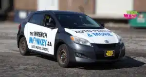
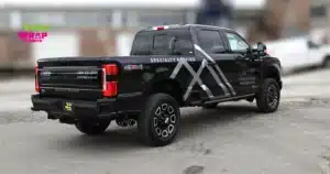
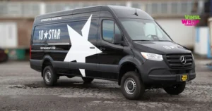
Vehicle-Specific Font Considerations
Different vehicle types present different canvas sizes and viewing angles. Here’s how typography strategy adapts across common commercial vehicles in the GTA:
| Vehicle Type | Primary Viewing Angle | Recommended Min. Font Height (Headline) | Notes |
|---|---|---|---|
| Cargo Van (side panel) | Parallel (driver passes alongside) | 150–200mm | Most common commercial vehicle in urban Toronto |
| Box Truck (side panel) | Parallel + slight angle | 200–300mm | Large canvas; hierarchy critical |
| Pickup Truck (tailgate) | Head-on (traffic behind) | 100–150mm | Short dwell time; keep it to 3–5 words max |
| Car / SUV (full wrap) | All angles | 80–120mm | Limited space; prioritise name + phone |
| Semi-Trailer (side) | Parallel at highway speed | 300–500mm | Longest read time; typography can be more detailed |
| Motorcycle | All angles | 40–60mm | Minimal text only; logo-focused design |
How Vinyl Wrap Toronto’s In-House Design Team Handles Typography
At Vinyl Wrap Toronto, typography decisions are never left to chance. Our in-house graphics design team works through a structured process for every commercial vehicle lettering project:
- Brand audit: We review your existing logo, brand colours, and any print assets to ensure the wrap typography is consistent with your overall identity.
- Vehicle template mapping: We plot the exact contours, panel seams, and hardware locations for your specific vehicle make and model before placing a single letter.
- Legibility testing: Our designers evaluate text at simulated viewing distances — 10 metres, 25 metres, and 50 metres — to confirm readability at typical urban and highway speeds across the GTA.
- Contrast verification: We check every text-to-background colour pairing against legibility standards before finalising.
- Client approval: You receive a detailed digital proof showing the wrap layout across all panels before we print a single sheet of vinyl.
All wraps are printed using premium vinyl from 3M and Avery Dennison, and installed by our certified and experienced team at our Etobicoke shop. Every commercial vehicle lettering project is backed by our 3-year warranty against peeling, bubbling, or fading.
Pricing Factors for Lettering and Typography-Focused Wraps
Typography-heavy designs — such as lettering and decals or partial wraps — are often the most cost-effective entry point for businesses in Toronto and the GTA.
| Service Type | Typical Price Range (CAD) | Best For |
|---|---|---|
| Basic lettering & decals | $300 – $800 | Contact info, simple branding |
| Partial wrap (one panel) | $700 – $1,500 | Side panel with full branding |
| Partial wrap (multi-panel) | $1,200 – $2,500 | Van or truck, 2–3 panels |
| Full vehicle wrap | $2,500 – $5,500+ | Maximum brand coverage |
| Fleet wrap (per vehicle) | Custom quote | Volume discounts available |
Prices vary based on vehicle size, design complexity, and vinyl type. Contact us for a free estimate.
Cost factors that affect your typography-focused wrap include the number of colours in the design, whether custom fonts require licensing, the size of the vehicle, and the number of panels involved. Our team is transparent about pricing from the first conversation — no surprises.
Real-World Application: Typography That Works on GTA Roads
Consider a heating and cooling company operating across Vaughan, Brampton, and north Toronto. Their fleet of five cargo vans needed to stand out in heavily trafficked areas — residential neighbourhoods, construction zones, and major arterials like Jane Street and Dufferin.
The solution: Montserrat ExtraBold for the company name in white on a navy background, Highway Gothic for the service list in a slightly smaller size, and a bold yellow telephone number at 120mm height positioned in the lower third of each side panel — the natural eye-level reading zone for drivers in adjacent vehicles.
Result: The typography reads clearly from a full lane’s width away, the colour contrast holds in both bright sunlight and overcast Ontario winter conditions, and the phone number sits in the zone most likely to be glanced at by a stopped driver.
This is the kind of result that’s achieved when commercial vehicle lettering is treated as a strategic branding decision, not just a style choice.
Internal Resources: Explore More Wrap Options
If you’re exploring beyond lettering and want to understand the full range of options for your vehicle or fleet, these pages will help:
- Full Car Wraps in Toronto — maximum brand coverage for personal and commercial vehicles
- Partial Car Wraps in the GTA — cost-effective branding for specific panels
- Van Wraps — full, partial, and lettering options for all van types
- Truck Wraps — from pickups to box trucks and semis
- Commercial Vehicle Wraps — fleet and business-focused solutions
- Car Wrap Colours (Avery Dennison & 3M) — explore our full vinyl colour catalogue
- Understanding Car Wrap Costs — detailed pricing breakdown
- Colour Psychology for Commercial Van Branding — pair typography choices with the right colours
Frequently Asked Questions (FAQ)
-
What is the most readable font for a vehicle wrap?
Geometric and humanist sans-serif typefaces in bold or extra-bold weights are consistently the most legible for vehicle wraps. Fonts like Montserrat Bold, Futura Bold, Highway Gothic, and Proxima Nova Bold are industry-standard choices for commercial vehicle lettering across Canada. The key factors are a bold stroke weight, generous x-height, and adequate letter spacing — not decorative complexity.
-
How large does text need to be on a vehicle wrap to be readable at highway speeds?
As a general industry guideline, text must be at least 25mm tall for every 3 metres of viewing distance. For highway readability at 100km/h, where a driver has 2–3 seconds of view time, your headline text should be a minimum of 150mm tall on a van side panel, with phone numbers no smaller than 75–100mm. Always confirm sizing with your wrap designer using real-world legibility testing.
-
Should I use serif or sans-serif fonts on my vehicle wrap?
Sans-serif fonts are the recommended choice for most vehicle wrap applications. They perform better at high speeds and in varying light conditions because their clean, unadorned strokes remain distinct at distance. Slab-serif fonts (with bold, rectangular serifs) can work effectively for headlines but thin or traditional serifs should be avoided. If in doubt, choose a bold sans-serif — it will outperform almost any alternative on the road.
-
Can I use my existing brand font on my vehicle wrap, or do I need a different one?
You can often use your existing brand font if it meets legibility standards — but many popular brand typefaces are too thin, too decorative, or too condensed to work at speed. Your wrap designer should evaluate your brand font against the criteria outlined in this article. If it doesn’t meet the standard, they can recommend a complementary alternative that maintains your brand identity while improving on-road legibility.
-
How many fonts should I use on my vehicle wrap?
A maximum of two typefaces is the standard recommendation for vehicle wrap design. Using more than two fonts creates visual competition and makes the design harder to read and remember in a short window of time. Typically, one bold typeface is used for the company name and headlines, and one secondary typeface is used for supporting information like taglines or service lists.
-
Does Vinyl Wrap Toronto provide custom font and lettering design as part of the wrap service?
Yes. Vinyl Wrap Toronto has an in-house graphics design team that handles typography, layout, and full custom wrap design as part of the service. Whether you have an existing brand identity that needs to be adapted for your vehicle or you’re starting from scratch, our team can create a design that’s both on-brand and optimised for high-speed readability. A free estimate is available for all projects.
-
How do background colours affect font readability on a vehicle wrap?
Background colour has a major impact on how readable your vehicle wrap fonts are. The highest-contrast pairings — white on black, black on white, white on navy, yellow on black — are also the most legible at speed. Avoid low-contrast pairings such as red on dark blue, grey on silver, or orange on yellow. Contrast should be evaluated under different lighting conditions, including overcast Canadian skies and direct sunlight, both of which are common in Ontario throughout the year.
Conclusion: Your Font Choice Is a Business Decision
The right vehicle wrap fonts don’t just look good in a design presentation — they work hard every single day your vehicle is on the road. Whether you’re operating a single service van in Etobicoke or managing a fleet across the GTA, Mississauga, Brampton, and Vaughan, the typography on your wrap is either generating leads or letting them slip past at 100km/h.
At Vinyl Wrap Toronto, we combine premium 3M and Avery Dennison vinyl materials, certified installation, and professional in-house design to ensure your commercial vehicle lettering performs the way it should — boldly, clearly, and reliably, backed by a 3-year warranty.
Ready to turn your vehicle into a high-visibility brand asset? Call us at 416-746-1381, email info@VinylWrapToronto.com, or visit us at 24 Ronson Dr, Unit 1, Etobicoke, ON M9W 1B4 for a free estimate. Serving Etobicoke, Toronto, the GTA, Mississauga, Brampton, Vaughan, and all of Ontario.