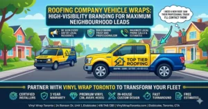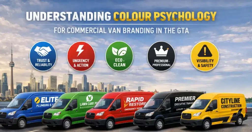
In highly competitive markets like Toronto, Etobicoke, Mississauga, Brampton, and Vaughan, your commercial van is more than transportation — it’s a moving advertisement working every hour you’re on the road. But while many businesses invest in logos, messaging, and layouts, one of the most powerful branding tools is often underestimated: colour psychology.
Colour plays a critical role in how people perceive your business before they ever visit your website or make a call. In fact, the colours used in commercial van branding can directly influence trust, recall, and response rates — especially in fast-moving GTA traffic.
At Vinyl Wrap Toronto, we’ve worked with contractors, fleet managers, and business owners across the GTA for years. One thing is clear: vans with intentional colour strategy consistently outperform those designed purely on aesthetics. This guide explains how colour psychology works in real-world van wrap design, how different colours are perceived locally, and how to choose a colour scheme that supports lead generation — not just looks good.

Why Colour Psychology Matters in Commercial Van Branding
Commercial van branding is a form of visual decision-making at speed. Most people see your van for only a few seconds — while driving, walking, or waiting at a light. In that short moment, colour communicates far more than words ever could.
Effective colour use helps:
- Create instant brand recognition
- Establish credibility and professionalism
- Improve readability from a distance
- Trigger emotional responses
- Encourage action (calls, searches, website visits)
In busy areas like downtown Toronto or the 401 corridor, your van competes with dozens of other visual distractions. Colour is what helps your brand cut through the noise.
This is why professional commercial vehicle wraps rely on colour psychology, not guesswork.
How People Perceive Colour on Commercial Vans in the GTA
Colour perception isn’t universal — it’s influenced by environment, culture, and context. Below is how common colours perform specifically in GTA commercial van branding, based on industry research and hands-on experience.
Blue: Trust, Reliability, and Professionalism
Blue is one of the most effective colours for commercial vans operating across the GTA.
Common industries using blue:
- HVAC companies
- Plumbing and electrical services
- Property maintenance
- Corporate and B2B services
Blue conveys dependability and calm — critical when customers are choosing service providers for their homes or businesses. In suburban areas like Mississauga and Vaughan, blue-branded vans often feel safer and more established.
For best results, blue works well when paired with white or light grey lettering to maintain high contrast.
Red: Urgency, Energy, and Action
Red naturally draws attention and creates a sense of urgency.
Best suited for:
- Food delivery and catering
- Emergency and restoration services
- Limited-time promotions
Red performs well in dense urban areas like Toronto, where visual competition is high. However, too much red can feel aggressive, so it’s often best used as an accent colour rather than a full background.
Green: Eco-Friendly, Clean, and Responsible
Green is strongly associated with sustainability and health.
Common uses include:
- Landscaping and lawn care
- Cleaning services
- Eco-conscious trades
In residential GTA neighbourhoods, green branding often signals responsibility and trustworthiness — especially when combined with clean, minimal van wrap design.
Black, Charcoal, and Dark Grey: Premium and Authoritative
Dark tones communicate confidence, quality, and experience.
Best for:
- High-end contractors
- Executive transport
- Technology and creative firms
Dark colours require strong contrast to remain readable. Metallic, white, or reflective lettering is often recommended to prevent loss of visibility, especially at night.
These tones are frequently used in a full van wrap where branding aims to feel premium rather than loud.
Yellow and Orange: Visibility and Safety
Bright colours like yellow and orange are highly visible, even in poor weather.
Common industries:
- Construction
- Road services
- Towing and recovery
These colours stand out on highways and industrial routes across the GTA and are often combined with black or dark blue for contrast.
Matching Colour Psychology to Industry Expectations
While creativity matters, industry norms also influence customer trust. A colour scheme that feels “off” for your industry can create hesitation.
| Industry | Recommended Colours | Why It Works |
|---|---|---|
| HVAC / Plumbing | Blue, White | Clean, reliable |
| Construction | Yellow, Black | Safety, visibility |
| Cleaning Services | Blue, Green | Hygiene, trust |
| Food Services | Red, Orange | Appetite, urgency |
| Professional Services | Grey, Navy | Credibility |
The strongest commercial van branding balances industry familiarity with subtle differentiation.
Contrast and Readability: Where Most Van Wraps Fail
One of the most common mistakes we see is poor contrast.
A wrap can look impressive up close but fail completely when viewed from 20–30 metres away — or while moving. In the GTA, your van is rarely viewed in ideal conditions.
Key readability principles:
- High contrast between background and text
- Simple, bold fonts
- Limited colour palette
- Clear hierarchy (business name → service → phone)
Your phone number and service should be readable in under three seconds. This is especially important for van lettering and decals, where space is limited.
Full Wrap vs Partial Wrap: Colour Strategy Differences
Colour psychology applies differently depending on wrap coverage.
| Wrap Type | Colour Strategy |
|---|---|
| Full Van Wrap | Strong brand takeover, bold base colour |
| Partial Van Wrap | Strategic accents and contrast |
| Decals & Lettering | Maximum readability, minimal colours |
With less surface area, partial wraps rely more heavily on smart colour placement. Many businesses see excellent ROI using a partial van wrap combined with high-contrast graphics.
How Vinyl Finish Affects Colour Perception
Colour appearance changes depending on vinyl finish.
| Vinyl Finish | Visual Effect |
|---|---|
| Gloss | Bright, high-impact |
| Satin | Modern, refined |
| Matte | Subtle, premium |
| Metallic | Eye-catching, upscale |
| Reflective | Increased night visibility |
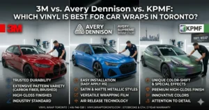
Vinyl Wrap Toronto uses premium materials from 3M, Avery Dennison, and Hexis, selected specifically for durability and colour stability in GTA conditions.
Common Colour Mistakes in Commercial Van Branding
Avoid these frequent issues:
- Choosing colours based only on personal taste
- Ignoring contrast and legibility
- Using too many colours
- Inconsistent branding across fleet vehicles
- Designing without professional input
A simple, well-planned colour scheme almost always outperforms a complex one.
Our Approach to Colour Strategy at Vinyl Wrap Toronto
Every commercial van branding project includes:
- Industry and audience analysis
- Colour psychology planning
- Custom van wrap design
- Vinyl and finish selection
- Certified professional installation
What you can expect:
- Free estimates
- Fast turnaround
- In-house graphic designers
- Certified installers
- 3-year warranty on defective materials
📍 24 Ronson Dr, Unit 1, Etobicoke, ON M9W 1B4 (Get Directions)
📞 416-746-1381
📧 info@VinylWrapToronto.com
Frequently Asked Questions (FAQ)
-
What is the best colour for commercial van branding?
There is no single best colour. Blue builds trust, red drives urgency, and high-contrast designs improve visibility.
-
Does colour really affect lead generation?
Yes. Colour influences recognition, trust, and recall — all key to turning impressions into calls.
-
Can I change my van’s colour later?
Yes. Vinyl wraps are removable and protect the original paint underneath.
-
Are darker colours harder to maintain?
They may show dust more easily, but premium vinyl minimizes long-term issues.
-
Is reflective vinyl worth it?
For service vans operating early mornings or evenings, reflective elements significantly improve visibility.
-
Should fleet vans all use the same colours?
Yes. Consistent colour usage strengthens brand recognition.
Conclusion: Colour Is a Strategic Business Choice
In competitive GTA markets, commercial van branding isn’t about decoration — it’s about communication. The right colour choices help your business look trustworthy, professional, and memorable in seconds.
If you’re planning a new wrap or updating your fleet, Vinyl Wrap Toronto can help you choose colours that support your brand and your growth goals.
👉 Contact us today for a free estimate and professional colour consultation.